During my daily work, I do a lot quick data checks on various (energy and development) indicators. For sure the classic way is to go EIA, BP, World Bank or one of the other large, established databases and copy the data into Excel or so and start staring. Nowadays, I would find it actually more convenient – and sometimes faster – to just directly load the data from the databank into a pandas dataframe and do a prettier-than-Excel plot with matplotlib. But if I want to share the data with somebody or make it interactive, this doesn’t cut it. Then I would turn to D3 and NVD3. However, loading the data into D3 is fairly cumbersome, this is not even the hardest part. If you want to eliminate the intermediary step of processing and formatting with pandas, then you have some serious work to do.
Most of the online databases give you the data in either an Excel file and rarely a csv or an XML. The data almost never comes in native Javascript JSON format. And if mining the data was not cumbersome enough, converting it into a D3 – readable format will take up a significant amount of your time. Until now: meet Quandl. Quandl is a data-aggregator that takes numeric data from the large online databases (or individuals) and normalizes them and gives you access in all formats, including JSON. This means it is enough to write a not-so-complicated Javascript data-parser and all you have to do later is to change the Quandl database codes to get pretty plots – a data-blogger’s dream 🙂 This is exactly what I did.
Quandl uses short database codes, similar to that of the World Bank to reference their data. These contain the country names usually in a 2 or 3 letter ISO format. So first, you need to grab the country names and their corresponding ISO codes from a public csv file with D3. Then, after doing some background searching among the Quandl data, you can define the short code that you want to load and you can obverse how is the country code embedded in the link structure. Then, using asynchronous JavaScript requests, you can load the desired indicator for the desired country/year. Voila – the bonus great thing about Quandl is that you can also upload (via plugins) and use your own datasets for your visualizations, as long you follow their conventions.
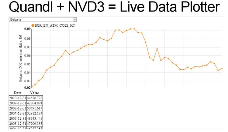
Made with d3, nvd3 and Quandl. The main outcome is the NVD3 + Quandl block.
From now on, I will start slowly shifting to d3plus, developed by Alexander Simoes at the MIT Media Lab, because of its superiority of handling multiple visualization types, compared to nvd3.


You should also look at Bokeh: http://bokeh.pydata.org
LikeLiked by 1 person
Yes, I love Bokeh! The need for a webserver makes it less attractive though – although it brings live animation to the table.
LikeLike
Thanks a lot
http://www.bijudesigner.com
LikeLike