UPDATE: This post has been developed into a web-app! This fresh post gives an introduction.
PREVIOUS: Colorful Development: RGB-coded Multidimensional HDI
Click here to look at the data visualization only on visualizing.org.
This post is an update on the Colorful Development: RGB-coded Multidimensional HDI post. But this time I’m bringing you dynamic plots – spanning over the 1980-2013 period, giving us a much more comprehensive picture than a simple world (chloropleth) map about how did human development change in the past 3 decades! In particular, we will look at the evolution of the inequality between the three components (Health, Education, Income) of the Human Development Index. For this, we will need to use tripolar RGB–HDI plots (I also call it a colorwheel), a rather peculiar 3 dimensional coordinate system defined in the previous post , so make sure you take a look first.
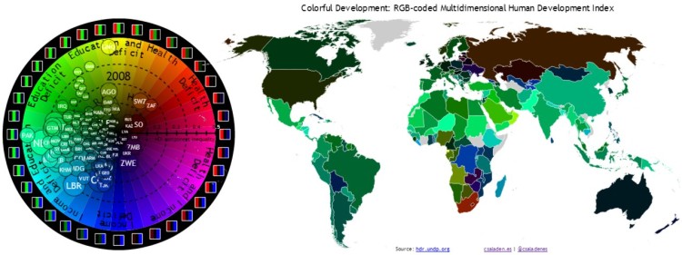
We kick off by diving straight into the development dynamics of the past 30 years. Let us recall the HDI RGB Color Wheel (sometimes also called a tripolar plot because of the three principal color axes), about the inequality between the components of the HDI (svg here):
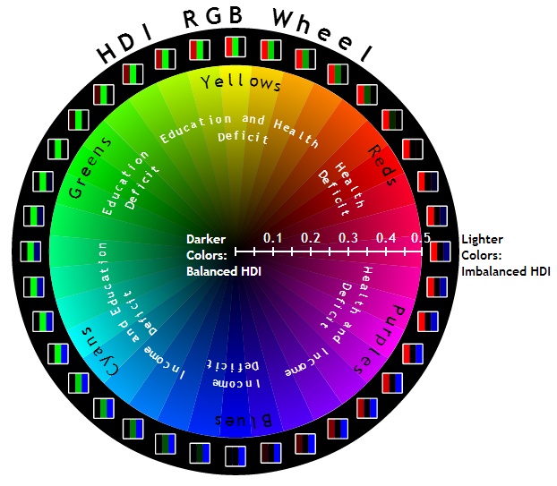
The color of the countries (the Hue) represents the relative inequality (or imbalance) between the components of the HDI. Based on the convention defined previously, a red-shifted country stands out as one with lower Health Index than Income or Education, a green-shifted country has Education as the lowest index and a blue-shifted country has Income as the lowest. Brightness of the color of a certain country indicates the level of imbalance or inequality between the HDI components (numerically equal to difference between the maximum and minimum valued HDI component). A very bright country has one component 0.3-0.5 points lower than the others. Now, using the values for the 3 HDI components, we can place the countries on the HDI RGB Color Wheel (interactive and dynamic version):
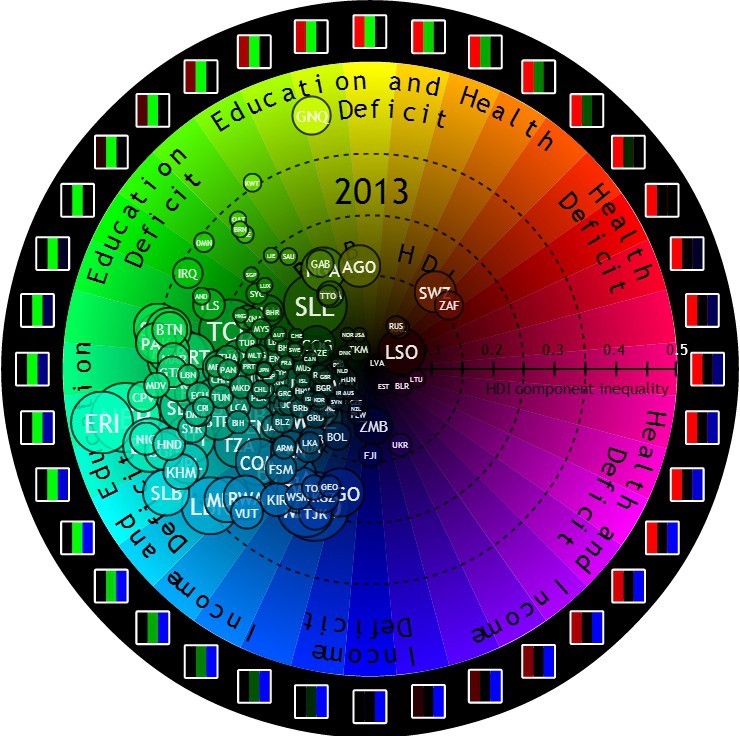
We see again the results of the previous post (except that the diameter of the bubbles now is proportional to their aggregate HDI deficit instead of population – meaning the larger the bubble of a country, the lower its HDI) and almost the entire world shows up as some shade of green or blue! This means Education is, in general, the lowest of the three HDI components. This is, in fact, the most concerning region: cyan – these countries have a deficit in both Education and Income – a very difficult developmental stage to be in, also known as the poverty trap. But let’s see how have these indices changed over the past 30 years (video and interactive version):
The dynamic data is quite striking:
A very small number of countries are in the Health Deficit zone (this is contrasting with the fact that a great (in fact, the largest) portion of development aid is going towards the health sector – while the current positive situation is arguably thanks to vast aid contributions to this sector in the past and up until now, it is questionable whether continued targeting of this sector brings comparable benefits to rather spending it on the other two sectors). In the 80s and the beginning of the 90s there are no countries in Health Deficit. At the end of the 90s and up until today the only countries in this zone are those in the AIDS-affected region of southern Africa.
We can see that while in 1980, most of the world was green-shifted, by today they have mostly moved down to the cyan region. The meaning of this is that the Income indicator has now a larger deficit than it used to, which corresponds to the reality that GDP is not improving as fast as access to healthcare or education. This brings up the very complicated (and very contested) question of does even using economic growth or economic well-being to assess development or human well-being make sense at the very essence? While there are very remarkable alternatives, it is still believed that GDP and economic activity is a necessary evil when studying development.

While HDI inequality has been significantly reducing, on average, in the 80s and 90s, it has been stagnant, or actually increasing for quite a few countries since the early 2000s. This is especially true for poverty-stricken African countries. What makes the situation even more gloomy is that the countries on the perimeter of the color wheel have large bubbles, meaning that these countries not only have an imbalanced HDI, but also a low one overall!
When looking at the evolution of individual countries, we can identify a few characteristic patterns:
- The steep rise of China from the country with one of the lowest HDIs and the most extreme Health and Income Deficit in 1980 to a middle HDI and moderate to low imbalance today.
- The intriguing evolution of war-torn Cambodia: Directly in the aftermath of the Cambodian Genocide Health is the most problematic area, but then during the Cambodian-Vietnamese war of the 80s the country starts drifting initially towards the blue and later the cyan region, due to the systemic effects of armed conflicts.
- The economic struggle of post-soviet Central Asian states, Kyrgyzstan and Tajikistan in particular. In 1990 Takijistan has a clear Income Deficit of 0.11. This peaks at 0.30 in 2000, and it has only slightly reduced since.
- The ripple effects of the Rwandan genocide and Zimbabwean economic meltdown. In 1996 Zimbabwe had a relatively high HDI of 0.456 for its region and it had a perfectly balanced HDI. Until 2000, the country entered into a period of fast rising Health Deficit, due to various effects of the AIDS epidemic and the Second Congo War. Then, as the effects of the war started to show in the Zimbabwean economy, the country started to shift from a Health Deficit towards and Income Deficit, ending up with one of the highest, 0.22 imbalances in HDI by 2013, mostly Income Deficit. Rwanda exhibited a very similar pattern in the early 90s, and having a serious Income Deficit even today.
- Many other trends…
Using the dynamic data, here is my bonus for today: a world map of the evolution of the RGB HDI in the past 3 decades (also check the interactive versions: the map alone and the map+colorwheel combined):
Then we can combine the world map with the colorwheel to yield and interactive and dynamic infographic, the Colorful Development: Dynamic RGB HDI Combo Map!
By studying the imbalance between HDI components using the technique of plotting the countries on RGB color wheels or tripolar RGB plots and carefully following their evolution over time, we can identify yet unseen or unclear patterns in development and get an insight into ripple effects of conflicts aiding us in the future conflict resolution, preparation of aid and possibly even prevention of humanitarian disasters. With the help of the RGB color model, we can revive the multidimensionality of the HDI and we instantly get inter-dimension normalization. That is, a greenish country will have a Education as its lowest index, no matter, how high is its HDI (how dark or light green its color is), given that the RGB color components are taken relatively to each other. This can be regarded as a powerful instrument when deciding country policies and defining priorities in case of limited funding. It can also help to identify global patterns (such as green or cyan shift of countries) in order to make better decisions on where to direct international aid and what policies to aspire to converge on under temporal, spatial and financial constraints and pressure.
The open data was taken directly from the UNDP and processed into JSON with this IPython notebook, using pandas. Visualizations were entirely made with d3.js and projected onto the world map with topojson. They all use svg format. The three main outcomes are the Interactive HDI RGB Dynamic Color Wheel, the Colorful Development Dynamic World Map and the Combined Colorful Development Dynamic World Map + Color Wheel. If you liked this post or have any questions or thoughts, Like, Share, Comment, and Subscribe!


This post has been featured on the official HDR blog.
LikeLike
Hi congratulations on your site I love it! I wanted to ask you how do you allow for wordpress interactively visualize your graphics ? Which program do you use?
LikeLike
Hi etnovisual! Unfortunately, WordPress.com does not allow that 😐 So I usually host them on my personal web space and just put a screenshot with a link in the blog post. You can embed them with an iframe if you have a WordPress.org blog though. For visualization I use d3.js.
LikeLike