This post has been prepared as part of a submission to the Cartagena DataFest 2015.
Click here to look at the data visualization only on visualizing.org.
PREVIOUS: Colorful Development: RGB-coded Multidimensional HDI
PREVIOUS: Colorful Development: Dynamic Graphs
Background
This post is an update on the Colorful Development: Dynamic Graphs post – a data visualization that has evolved into a full-fledged web-app: an updated, prettier version with a lot of user interface enhancements that now includes the inequality and gender-adjusted human development indices as well.
In this post we will look at the evolution of the inequality between the three components (Health, Education, Income) of the Human Development Index (HDI), and the Inequality Adjusted Human Development Index (IHDI) using a web-app I have constructed. To make for a comfortable reading, but also for a strong basis, first we will concentrate on the user interface. I have prepared this as part of a submission to the Cartagena DataFest 2015 data visualization competition. As before, for this, we will need to use tripolar RGB–HDI plots (I also call it a colorwheel), a rather peculiar 3 dimensional coordinate system defined in this previous post , so make sure you take a look first, as well as the update discussing converting the RGB plot into a dynamic graph with an adjacent world-map. Let us briefly recall the HDI RGB Color Wheel, a customized coordinate system designed to reflect the inequality between the components of the HDI (svg here). Let us call this inequality HDI Component Imbalance.

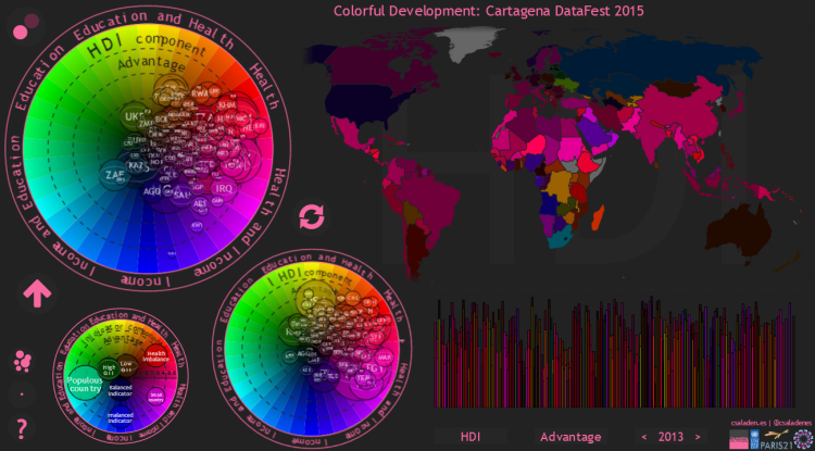
The color of the countries (the Hue) represents the relative inequality (imbalance) between the components of the HDI. Based on the convention defined previously, a red-shifted country stands out as one with lower Health Index than Income or Education, a green-shifted country has Education as the lowest index and a blue-shifted country has Income as the lowest. Brightness of the color of a certain country indicates the level of imbalance or inequality between the HDI components (numerically equal to difference between the maximum and minimum valued HDI component). A very bright country has one component 0.3-0.5 points lower than the others. Now, using the values for the 3 HDI components, we can place the countries on the HDI RGB Color Wheel, and the same is true when using the 3 components of the IHDI. Likewise we have created a twin axis of HDI-IDHI colorwheels. When opening up the web-app, these colorwheels take up most of the left part of the screen, along with a third, smaller colorwheel that dubs as a legend.
Description of the user interface
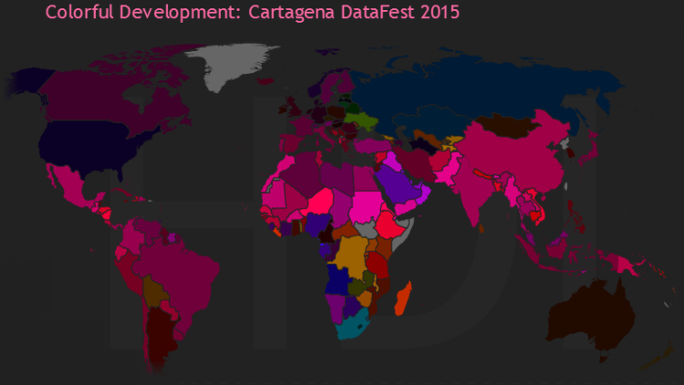
The main colorwheel, by default, contains the HDI RGB-plot and the secondary (smaller, lower to the right) features the IHDI data. There are two other major user interface elements: a world map reflecting the data from the main colorwheel – that is a country on the world map will be colored accordingly to its HDI (or IDHI, if selected) component imbalance, as described above and the previous two (1, 2) introductory posts, whereas its brightness will indicate the scale of this imbalance. Since the RGB-plot does not provide direct information about the value of the main HDI index, I have included a bar chart for that in the lower right corner of the web-app. This also contains the IHDIs of countries (which are of course smaller than the main HDI bars, accounting for loss in development due to inequality). The world map supports panning and mouse-wheel zooming.
On the bar-chart the countries are sorted left-to-right, by their population. The bubble sizes on the colorwheels are also proportional to population (because of many other user interface elements that needed to be incorporated for this web-app I have disabled the user’s ability to adjust bubble size – that feature, however is already available in the dynamic graphs post). One of the niches of the web-app is that the 4 individual data visualizations are cross-linked, therefore hovering over one of countries on one of graphs will highlight that particular country’s position on the other 3 graphs. Upon hovering, a tooltip will show the breakdown of the HDI and IDHI indices, as well as the GII and by clicking, the country floats to the top of the colorwheel. The web-app supports browsing of dynamic data. One can step in time either using the keyboard arrows keys or clicking the year button in the lower right corner. Note that HDI is data is available for the entire 1980-2013 range, IHDI is available from 2010 until 2013, while GII is available from 1995, with 5-year intervals until 2010, then yearly until 2013. GII (gender ineqaulity) data (when available) is visualized by an ellipse, superimposed over the data-bubbles. The difference between the radii of the ellipse corresponds to gender inequality, with a vertical ellipse being equivalent to a female-dominated country (virtually none), while a horizontal ellipse depicts a male-oriented country.
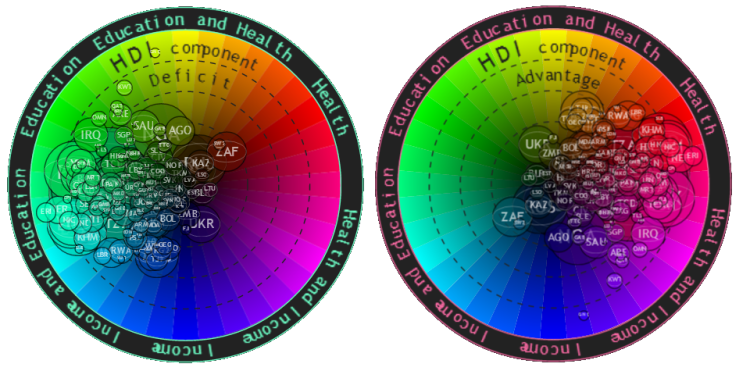
Another innovation in this verson of the HDI RGB plots is the added support for displaying both negative and positive imbalance: leading to a Deficit or an Advantage of one HDI (or IDHI) component compared to the other two (e.g. If a country has a higher Education indicator than Income or Health, it has an Education Advantage. This is equivalent to a combined Health and Income Deficit. Likewise, if a country has a lower Income than both Education, as well as Health, that means it has an Income Deficit. This is equivalent to an Education and Health Advantage, and so on). This mechanism has been described in detail in the first blog-post. The user can switch between the Advantage and Deficit by clicking the the Advantage/Deficit button next to year indicator. The visualization should change its basic display color during this process. We can switch between advantage and deficit also by using the arrow button to the lower left of the main colorwheel. By default (as opposed to the previous blogpost!), the web-app starts up displaying the Advantage of the HDI and IHDI components.
This brings me to the buttons: there are 3 groups of buttons, each consisting of 3 individual buttons. The main visualization control buttons are those with a text label, in the lower right part of the web-app.I have described two of these already, while the third button, on the left switches the indicator to be displayed on the main colorwheel from HDI to IHDI and back. Notice that, as you change the indicator displayed in the main colorwheel, the map colors follow. We can switch between HDI and IHDI also using the refresh button in the middle of the screen. A circular button in the top left corner allows us to highlight the differences between the countries, by applying a faux-brightness coloring to the datapoints.
The web-app has two distinct editing modes, blending the features of the two prior versions. This is controlled by the small button-group of the lower left corner. There is an Add all datapoints and a Remove all datapoints button (the third – help – button brings you back to this post). The first button enters Explore mode (this is how the web-app starts up, by default). The second toggles Edit mode. In Explore mode, the user can explore the datapoints of the RGB colorwheel. Hovering over a data-point or a country on the world map will highlight the cross-linked points in all of the graphs, to help getting a general picture of the country’s development, while clicking will bring that particular country to the top. Highlighted countries are not preserved upon advancing in time or switching indices. In Edit mode, the user starts with a blank colorwheel, and points can be added (or removed) one by one by clicking on the countries on the world map or the dimmed countries of the bar chart.
Brief insights
The design space that this web-app enables the user to explore extends beyond the length of one blog post. I plan to share the many lessons learnt form this web-app continually in future blog-posts, but after a first glance at the the dynamic data, the observations are quite striking: Let’s start by switching to Deficit display mode (to keep the convention started in the previous two blog posts): A very small number of countries are in the Health Deficit zone – almost all countries are in the Health Advantage zone. This is contrasting with the fact that a great (in fact, the largest) portion of development aid is going towards the health sector – while the current positive situation is arguably thanks to vast aid contributions to this sector in the past and up until now, it is questionable whether continued targeting of this sector brings comparable benefits to rather spending it on the other two sectors. In the 80s and the beginning of the 90s there are no countries with Health Deficit. At the end of the 90s and up until today the only countries in this zone are those in the AIDS-affected region of southern Africa (One caveat to mention here is that the colorwheels display component imbalances! – meaning that one particular country can have a low component imbalance but still a very low nominal HDI.) We can also see that while in 1980s, most of the world was green-shifted (using the Deficit display mode), by today they have mostly moved down to the cyan region. The meaning of this is that the Income indicator has now a larger deficit than it used to, which corresponds to the reality that GDP is not improving as fast as access to healthcare or education, a phenomenon I previously named as the “Great Cyan Shift”. Also, while HDI inequality has been significantly reducing, on average, in the 80s and 90s, it has been stagnant, or actually increasing for quite a few countries since the early 2000s. This is especially true for poverty-stricken African countries. What makes the situation even more gloomy is that the countries on the perimeter of the color wheel have large bubbles, meaning that these countries not only have an imbalanced HDI, but also a low one overall! When looking at the evolution of individual countries, we can identify a few characteristic patterns:
- The steep rise of China from the country with one of the lowest HDIs and the most extreme Health and Income Deficit in 1980 to a middle HDI and moderate to low imbalance today.
- The intriguing evolution of war-torn Cambodia: Directly in the aftermath of the Cambodian Genocide Health is the most problematic area, but then during the Cambodian-Vietnamese war of the 80s the country starts drifting initially towards the blue and later the cyan region, due to the systemic effects of armed conflicts.
- The economic struggle of post-soviet Central Asian states, Kyrgyzstan and Tajikistan in particular. In 1990 Takijistan has a clear Income Deficit of 0.11. This peaks at 0.30 in 2000, and it has only slightly reduced since.
- The ripple effects of the Rwandan genocide and Zimbabwean economic meltdown. In 1996 Zimbabwe had a relatively high HDI of 0.456 for its region and it had a perfectly balanced HDI. Until 2000, the country entered into a period of fast rising Health Deficit, due to various effects of the AIDS epidemic and the Second Congo War. Then, as the effects of the war started to show in the Zimbabwean economy, the country started to shift from a Health Deficit towards and Income Deficit, ending up with one of the highest, 0.22 imbalances in HDI by 2013, mostly Income Deficit. Rwanda exhibited a very similar pattern in the early 90s, and having a serious Income Deficit even today.
- Many other trends…
Also, the IHDI exhibits qualitatively different patters from the HDI – I will explore that in future posts! By studying the imbalance between HDI components using the technique of plotting the countries on RGB color wheels or tripolar RGB plots and carefully following their evolution over time, we can identify yet unseen or unclear patterns in development and get an insight into ripple effects of conflicts aiding us in the future conflict resolution, preparation of aid and possibly even prevention of humanitarian disasters. With the help of the RGB color model, we can revive the multidimensionality of the HDI and IHDI and we instantly get inter-dimension normalization. That is, a greenish country will have a Education as its lowest index, no matter, how high is its HDI (how dark or light green its color is), given that the RGB color components are taken relatively to each other. This can be regarded as a powerful instrument when deciding country policies and defining priorities in case of limited funding. It can also help to identify global patterns (such as green or cyan shift of countries) in order to make better decisions on where to direct international aid and what policies to aspire to converge on under temporal, spatial and financial constraints and pressure.
This post describes a web-app that I have submitted to the Cartagena DataFest 2015 data visualization competition by, featured by UNDP. Therefore, the data was uniform for all entrants, taken directly from UNDP. I have accessed the HDI, IHDI and GII datasets and processed them into JSON with this IPython notebook, using pandas. Visualizations were entirely made with d3.js and projected onto the world map with topojson. They all use svg format. The main outcome is the Colorful Development Cartagena DataFest 2015 web-app. If you liked this post or have any questions or thoughts, Like, Share, Comment, and Subscribe!


2 thoughts on “Colorful Development: Cartagena DataFest 2015”