UPDATE: This post has been developed into a web-app! This fresh post gives an introduction.
UPDATE: Please also check out the new post updated with dynamic plots for 1980-2013!

This post will be about the Human Development Index and the Red-Green-Blue color model (RGB). I present a novel approach towards visualizing the component inequality within the HDI and thus giving back its multidimensionality. The result is powerful as it highlights the main focus area for development policies for all countries at a glance (circular plot above – also check the interactive version)!
Formulated in the 90’s by Harvard Nobel laureate Amartya Sen, the HDI was developed as a means to set development targets for UN agencies and to create a way to monitor progress on those targets that is not solely based economic context. Right from the very beginning, the HDI received a lot of criticism for being redundant, having technical issues or not being overwhelming enough. The bottleneck of the HDI is arguably its apparent simplicity – concentrating a load of information into just one number and ranking entire countries based on that. Therefore many other replacement indices were suggested that claim to be more multidimensional and capture a wider picture of countries that is closer to reality. Perhaps the most famous of these is the Multidimensional Poverty Index, developed in 2010 by UNDP, used in conjunction with the HDI now in their official reports, and the Happy Planet Index, soon to be analyzed in an upcoming post. However, at the core the HDI is still very multidimensional but the way in which it is depicted today takes away this multidimensionality. Now I will try to give it back and defend the HDI’s validity, with some (large) asterisks 🙂
According to UNDP’s official definition, HDI is defined as the geometric mean of 3 sub-indexes (also called components or dimensions): ![HDI=\sqrt[3]{LEI \cdot EI \cdot II}](https://s0.wp.com/latex.php?latex=HDI%3D%5Csqrt%5B3%5D%7BLEI+%5Ccdot+EI+%5Ccdot+II%7D&bg=FFFDF6&fg=3C2323&s=0&c=20201002)
is the Life Expectancy Index or the Health Index
is the Education Index
is the Income Index
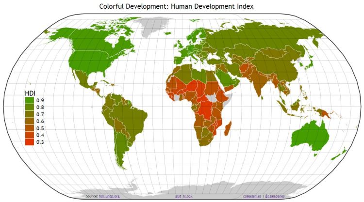
All of these are globally normalized and take values between 0 and 1, yielding another value, also between 0 and 1, for the HDI. Since this is a 3 dimensional problem and on top of that it has to be projected onto a world map somehow, the task of representing all of the information is challenging and therefore the three indices are usually converted into one, thus yielding the chrolopleth map below. However, a great deal of information is lost this way, since oftentimes there is a large discrepancy between the components (For example Haiti has an HDI of 0.471 with (LEI, EI, II) = (0.663, 0.374, 0.422). Lesotho has a very close HDI of 0.486, but with (LEI, EI, II) = (0.453, 0.504, 0.503). Notice the vastly different component values – Health has a difference larger than 0.2! )
Let us recall that on a computer all colors are made up as the linear combination of 3 basic colors: red, green and blue. This is called the RGB color model. Red is defined as (255,0,0), where 
With the help of the RGB color model, we can revive the multidimensionality of the HDI, by associating a color to each of its dimensions! Let’s associate:
- Health with red
- Education with green
- Income with blue
In the knowledge of the values for each of the above sub-indexes for all countries, we get a world map like this:

So how can we read this RGB-coded Multidimensional HDI map? – it contains a lot more information that it may appear so at first glance: The color of the countries (the Hue) represents the inequality between the dimensions of the HDI. Based on the convention defined above a red-shifted country stands out as a country with lower Health Index than Income or Education, a green-shifted country has Education as the lowest index and a blue-shifted country has Income as the lowest.

A very particular feature of the RGB mapping is that we instantly get inter-dimension normalization. That is, a greenish country will have a Education as its lowest index, no matter, how high is its HDI (how dark or light green its color is), given that the RGB color components are taken relatively to each other. This can be regarded as a powerful instrument when deciding country policies and defining priorities in case of limited funding. (We also get global normalization, based on the brightness of the color of a certain country, indicating the level of imbalance between the HDI components. A very bright country is probably in trouble as it has one component 0.3-0.5 points lower than the others!)

We see that the only significantly red-shifted country is South Africa. This means that it exhibits a lower Health index than Education and Income indexes. Thinking about the recent economic growth of the country, but also the severity of the HIV epidemic, this seems a plausible result. Many countries are green-shifted, meaning that they have lower Education than Health and Income, such as Pakistan. Blue-shifted countries are those with lower Income than Health and Education, for example Madagascar. Combinations of the basic colors also hold. Likewise, Ukraine shows up as purple, having lower Income and Health than Education, Angola is yellowish, with a lower Education and Health than Income, and so on.
So what does the RGB-HDI map tell us?
It is striking how almost the entire world shows up as some shade of green! This means Education is in general the lowest of the three HDI components. This is true for the developed world as well, with the notable exception of Australia (0.962, 0.979, 0.911). Russia shows up as brownish (brown being a shade of yellow: the combination of red and green), with a comparatively lower Health and Education than Income: (0.738, 0.779, 0.819). This means that if having equal success in all areas considered by the HDI is the ultimate target (as per the vision of UNDP), global resources should be concentrated more on programs related to boosting education (and the underlying statistic: years of schooling).
Almost all blue-shifted countries can be found in Africa, which shows up as dominantly blue-ish region. Even when not blue, the color-shift is always (sans South Africa) green, not red. This leads us to conclude that raising income and bettering education is a much more pressing problem than the health situation. This might be an unexpected finding (especially now, with Ebola), but it seems that the African nations are doing an extraordinary job comparatively to their limited financial resources. This could mean that even a small increase in African GDPs would lead to spectacular improvements in other fields, such as healthcare or education. However, it is also important to notice that blues usually appear only in light shades, meaning that most of these countries have an imbalanced HDI – so the phenomenon could be due to the geographical particularities or constrained to the lower values of the HDI. Higher HDI dark-blue countries are few, and usually are former Soviet states, such as Ukraine, Georgia, Uzbekistan, Kyrgyzstan, Tajikistan.
One final thing to notice is that they are close to no grey countries (Remember, shades of grey represent prefect balances between the colors). That means that almost all countries are lacking in some field. Moderate exceptions to this observation would be Hungary (0.84, 0.804, 0.809), Slovakia (0.852, 0.803, 0.836) and possibly Cameroon (0.54, 0.486, 0.49) and Turkmenisan (0.7, 0.68, 0.717), exhibiting almost uniform development across all three dimensions.
Plotting the countries on the RGB color wheel brings the above points into spotlight and gives an at-a-glance picture on global development and the critical areas for each country.
It is evident from the tripolar plot that Health is the most successful field, with only two points in the red region, Swaziland and South Africa.The income deficit of the African countries gets highlighted as well the education gap for most of the developing world – and even some extremely wealthy countries such as Qatar, Kuwait or Liechtenstein. Equatorial Guinea is in the far yellow region meaning that it had a much larger Income than otherwise the two indicators would predict. Yet in my opinion the most concerning region is the cyan one – these countries have a deficit from both Education and Income – a very difficult developmental stage to be in, close to the poverty trap.
This is just the start. I believe the HDI is not dead yet – it is a complicated indicator and still has a lot of possibilities and opportunities hidden inside it. The RGB-coded Multidimensional HDI can offer insights on local resource prioritization and policy-making and information about the global context. Surely, it takes some time to understand and fully delve into these a relatively complicated maps, but once understood, a lot of information can be harvested at a glance! – a policy-maker’s swiss-army knife!
Data directly from the UNDP processed with this and this IPython notebooks, using requests and pandas. Visualizations were entirely made with d3.js, projected onto the world map with topojson. They all use svg format. The two main outcomes are the Interactive HDI RGB Color Wheel and Colorful Development World Map.
UPDATE: Please also check out the new post updated with dynamic plots for 1980-2013!


This post has been featured on the official HDR blog.
LikeLike